Yuki Product Template
At Yuki Studio, we decided to switch from using the Chakra UI component library to shadcn, which is an open-source library that offers more flexibility and simplicity in setting up components. Shadcn is built on Next.js and styled with Tailwind CSS, making it a good fit for quickly starting new client projects. While the technical setup for shadcn was complete, we found that the design templates provided for Figma were not flexible enough for our needs as designers.

Task
My task was to improve the Figma file for shadcn components so it would be easier to adapt for different projects. This involved making the file more flexible and efficient for designers, while also ensuring that developers could quickly access design parameters that matched the code setup.
Adding Core Variables with REM values from Tailwind CSS
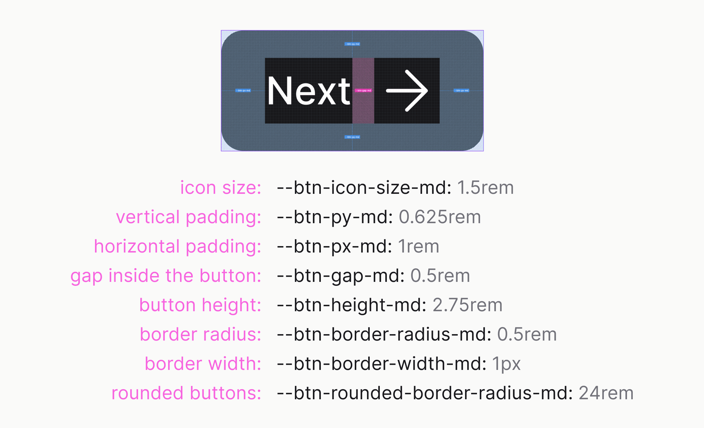
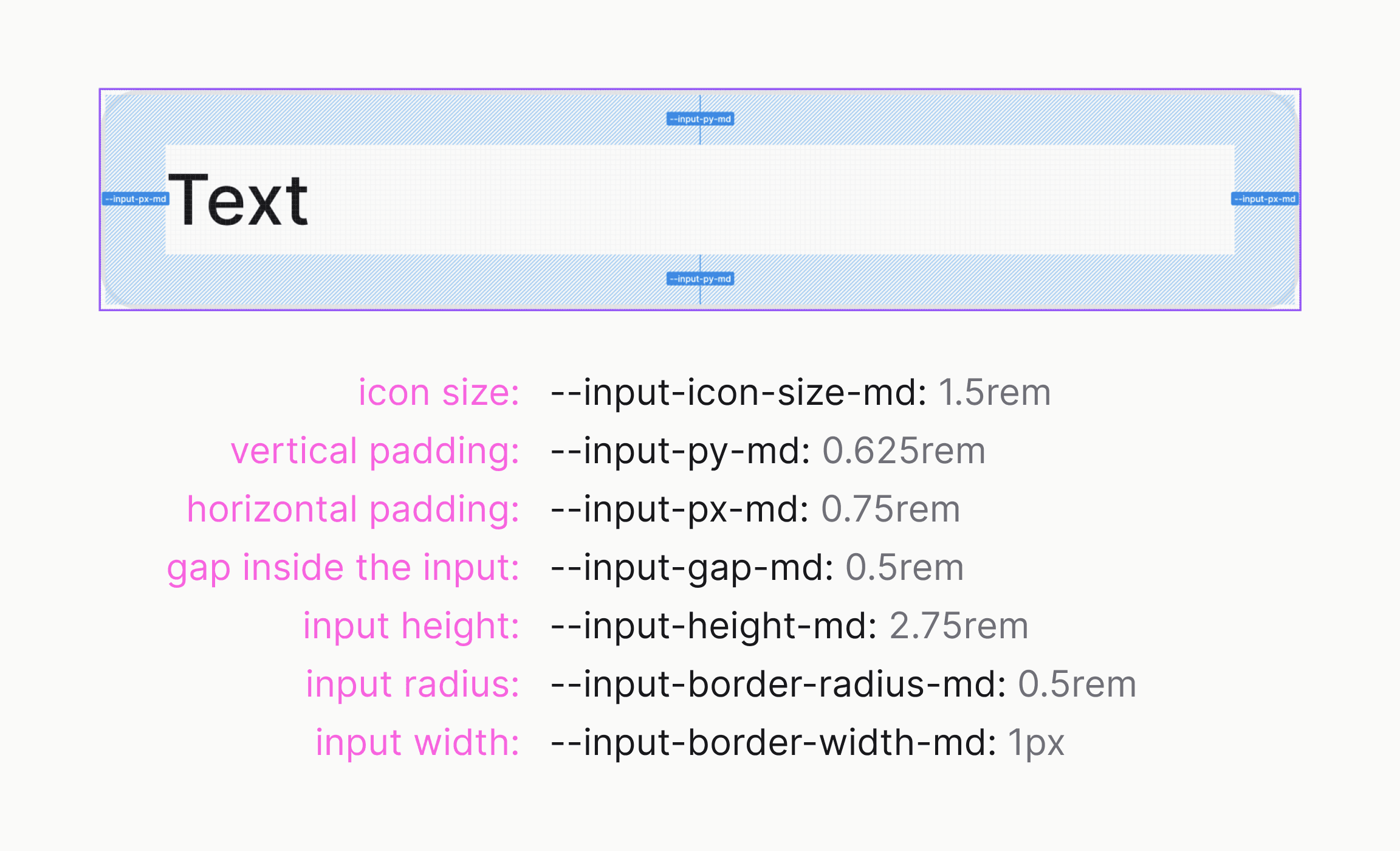
In the original Figma file, spacing values were in pixels, but the code used REMs, which created inconsistencies between design and code. To address this, I added REM values in Core Variables, such as spacing/0.5rem,spacing/1rem, and so on. This made spacing more consistent and simplified the handoff from design to development.
Setting up custom color scales using Dynamic Variables
While shadcn components come with Tailwind's default color palette, we often needed custom brand colors. I set up a way to quickly create color gradients in Figma using the Dynamic Variables plugin. This allowed us to create custom color scales from 200 to 900 shades for each brand.
For example, a lighter shade could usecd($base/base).lighten(.2), and a darker shade could usecd($base/base).darken(.2). These color scales could then be linked to theme colors, like setting for the foreground color.


Result
The improved Figma template saved time when starting new projects, as we had all the color and size variables ready to go for each brand. This setup achieved:
- Faster project startup thanks to ready-to-use parameters for colors and sizes for each brand,
- Increased flexibility of the design file, making it easy to adapt to each client's unique needs,
- Simplified integration between design and code, allowing developers to quickly access updated parameters through the JSON file and the custom script, which removed manual adjustments and sped up UI development.
The updated Figma template became a base for all new project files in our studio, boosting team efficiency and letting us focus more on creative design work.

